
Host Analytics and Pricing Copilot
Revenue, occupancy and per-listing performance in one view, with rate suggestions that explain their evidence before a host accepts.
These images are illustrations of the concept, not screenshots of the actual product.
Overview
Most independent hosts and operators price by instinct. Rates get set once at listing time, a quiet weekend passes unnoticed, and the only signal that something is wrong arrives months later as a thin payout. The numbers that would answer the question — how full the calendar actually is, which listing carries the business, how often bookings are cancelled — sit in separate places, if they are recorded at all. This concept brings performance and pricing together: a reporting surface that shows how a host's inventory is doing, and an advisory panel that turns those same numbers into a concrete rate suggestion.
The first illustration is the host's analytics home. A left panel groups the whole host workflow — bookings, listings, inbox, calendar, payments, reviews, analytics, marketing — and the page opens on a date range with four headline tiles for revenue, bookings, active users and conversion rate, each carrying a trend line and a change against the prior period. Below them a revenue-over-time chart with a monthly or finer granularity control sits beside a category breakdown that splits earnings across stays, tours, events and activities, so a host can see which side of a mixed portfolio is actually growing. An occupancy gauge and a ranked table of top listings close the page, the table pairing each listing with its category, booking count, revenue and a small trend.
The second illustration narrows to the provider portal's own analytics view and adds the pricing copilot. The same business appears as bookings, revenue, cancellation rate and capacity utilization, with a chart that pairs bookings and revenue bars over the period under a trend line, and a per-listing table that adds cancellations and utilization columns. The copilot occupies the right rail: it proposes a nightly rate for a named stay on a specific weekend and, crucially, shows its working — recent utilization, the cancellation rate, and a median for comparable stays nearby. The host can accept the suggestion, which the design routes through the ordinary listing-update path and records on the audit trail, or dismiss it. The panel is explicitly advisory.
In the wider product, this is where the marketplace's supply side gets its feedback loop. Provider onboarding and the availability calendar create the inventory; discovery and checkout fill it; this concept closes the circle by telling a host what happened and what to change next, without ever moving a price on its own.
What this concept shows
- Headline tiles for revenue, bookings, active users and conversion rate, each with a trend line and a change against the previous period
- A revenue-over-time chart with a granularity control and labelled points across the selected range
- A category breakdown that splits earnings across stays, tours, events and activities as segmented bars with per-row totals
- An occupancy gauge showing a single utilization figure with its change against the prior period
- A ranked top-listings table with category, bookings, revenue and a per-row trend
- A provider-portal view of the same business with cancellation rate, capacity utilization and Day, Week and Month granularity
- A pricing copilot that proposes a nightly rate for a named listing and specific dates
- An evidence box behind every suggestion — recent utilization, cancellation rate and a comparable-stays median — with accept and dismiss actions
How it works
- Open the analytics view and pick the reporting window, then read the headline tiles for revenue, bookings and conversion at a glance.
- Compare the revenue trend against the category breakdown to see which domain — stays, tours, events or activities — is carrying growth.
- Check the occupancy gauge and the top-listings table to find which inventory is full and which is under-booked.
- Switch to the provider portal's analytics for cancellation rate, capacity utilization and per-listing utilization columns.
- Read the pricing copilot's suggested rate for a listing and date range, and open its evidence box to see the utilization, cancellation and comparable-rate figures behind it.
- Accept the suggestion so it applies through the normal listing update and lands on the audit trail, or dismiss it and leave the rate unchanged.
Who it's for
- Hosts running guesthouses, boutique stays and independent accommodation
- Tour operators and activity providers with mixed inventory
- Venue and event organizers tracking ticketed demand
- Marketplace and revenue managers overseeing supply performance
Illustrations
2 illustrations of this concept. Select one to view it full size.
Host Analytics Home
This illustration shows a dark analytics page for a host account. A left panel headed for the host workflow lists Overview, Bookings, Listings, Inbox, Calendar, Payments, Reviews, Analytics as the active item, Marketing and Settings, above a card promoting an upgrade to a premium tier. The header carries a search field, notification and message badges with counts, and an account menu using a sample host name. The body opens with a date-range control and four metric tiles — total revenue, bookings, active users and conversion rate — each pairing a sample figure with a small trend line and a positive change against the prior period. Below, a revenue-over-time area chart with a monthly granularity control and labelled monthly points sits beside a category chart whose stacked bars break revenue down by stays, tours, events and activities. A circular occupancy gauge and a ranked top-listings table with category badges, booking counts, revenue and trend sparklines complete the page. All figures are invented sample data.
Provider Analytics With Pricing Copilot
This illustration shows the provider portal's analytics view, reached through a breadcrumb from the portal, with workspace and organization selectors in the header. A date-range picker sits beside a Day, Week, Month granularity toggle set to the weekly view. Four metric cards report bookings, revenue, cancellation rate and capacity utilization as sample values. A combined chart pairs bookings and revenue bars across the period beneath a flowing trend line, and a top-listings table lists each listing with its type — stay, tour, activity or event — alongside bookings, revenue, cancellations and utilization. The right rail holds a pricing copilot panel that proposes a nightly rate for a named sample stay on a specific weekend, and a dashed evidence box underneath cites recent utilization, the cancellation rate and a median for comparable stays in the same area. Primary and secondary buttons offer to accept and update the listing or dismiss the suggestion, and a footnote states the panel is advisory, with accepted changes applied through the normal listing update and recorded on the audit trail.
Topics
- host analytics dashboard
- dynamic pricing suggestions for hosts
- occupancy rate tracking
- revenue by category travel marketplace
- top listings performance report
- capacity utilization and cancellation rate
- provider portal analytics
- nightly rate recommendation
- travel host revenue management
- booking conversion metrics
Related concepts
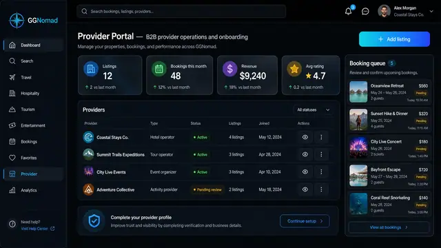
Provider Portal and Availability Pricing
One portal for hosts and operators to add listings, confirm bookings and set nightly rates, weekend pricing and blackout dates.
2 illustrations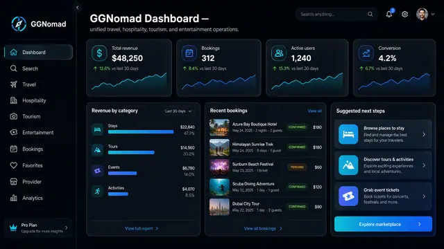
Marketplace Command Centre
One dashboard that shows how stays, tours, events and activities are performing, with recent bookings and the next thing to do.
1 illustration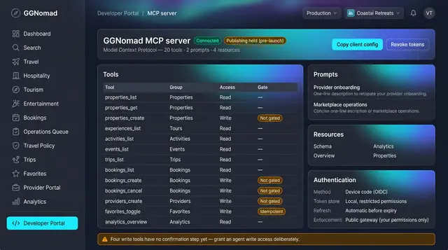
Agent Tools and Trip Watch
A governed tool surface for agents, and background watchers that raise decision cards a person accepts or dismisses.
2 illustrations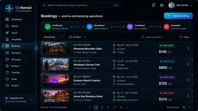
Booking Lifecycle and Audit Trail
Run every booking through a clear lifecycle and see exactly who changed what, and when, on an append-only audit trail.
2 illustrations